Today is World AIDS Day.
The HIV/ Aids epidemic is still ravaging around the world, even though major progress and advances have been made. We work heart-driven to highlight and address the role of alcohol as risk factor for transmission and progression of HIV/ Aids.
In that work, evidence and data are essential. That’s why I want to share with you this interactive data visualization tool that shows estimated trends in HIV/AIDS death, incidence, and prevalence worldwide and by country for the years 1990 to 2013.
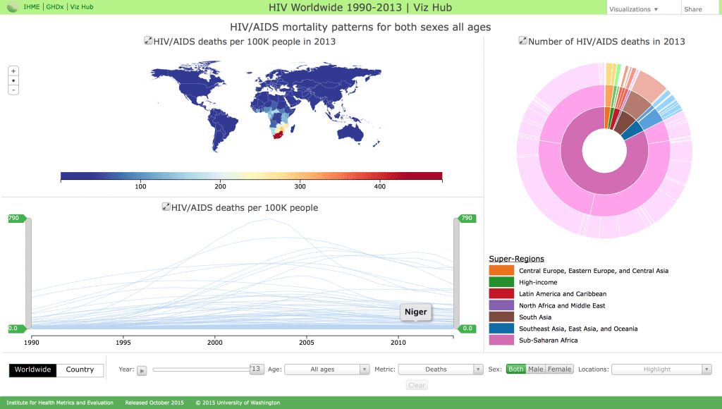
The Institute for Health Metrics and Evaluation has produced this useful overview. The IHME explains their method this way:
Estimated results were derived using a modified version of the UNAIDS Spectrum model based on a review of mortality on and off antiretroviral therapy. In concentrated epidemics we calibrated Spectrum to fit vital registration data corrected for misclassification of HIV deaths. In generalized epidemics we minimized a loss function to select epidemic curves most consistent with prevalence and demographic data. We incorporated a combination of data and reports from surveys, censuses, vital registration, and sample registration.
—
Citation:
Institute for Health Metrics and Evaluation (IHME). HIV Worldwide 1990-2013. Seattle, WA: IHME, University of Washington, 2015. Available from http://vizhub.healthdata.org/hiv/. (Accessed December 1, 2015)